The easiest way to describe this powerful feature is to provide some examples:
•Example ‘bus stop passenger frequency analysis'
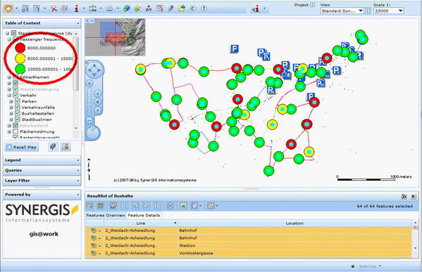
Think of a bus stop point data with a name attribute. Users can search on bus stops using the WebOffice 10 R3 client. For some users of a transportation company if might be very interesting to get detailed information on how many passengers use a specific bus stop each day. This bit of information is available in a software system used by the transportation company. Anyway the data is not available on relational database level as table or view but only as result of a complex business intelligence query in the software system of the transportation company. You can now use WebOffice 10 R3 for getting an easy to understand graphical aggregated analysis for each of the selected bus stops showing different symbols for different classes of returned attribute values:

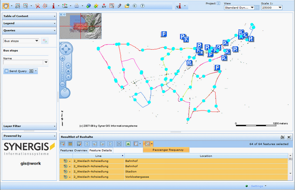
Search result toolbar with function for providing dynamic thematic mapping

Map with selected bus stops - before doing dynamic thematic mapping analysis

Map with selected bus stops displaying dynamic thematic mapping analysis
•Example ‘Sales volume for different sales regions within last three years’
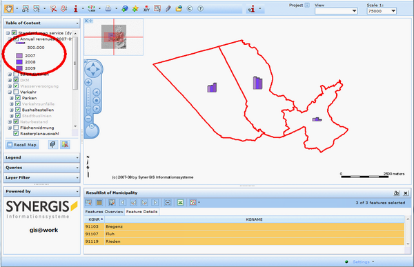
Another sample using a bar/column chart displays sales volume for different regions within the last three years

Search result toolbar with function for providing multiple different dynamic thematic mapping

Display of annual revenues for each of the sales regions using a bar/column chart
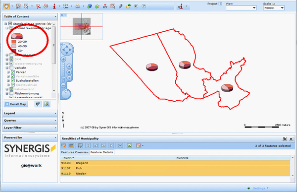
The last sample using a pie chart displays sales percentage for different age groups.

Display of revenue percentage for each age group for different sales regions